On January 12, 2021 eRA released new login and landing pages for eRA Commons. Both the login screen and the landing screens provide resources and information that are easily identifiable and centrally located on the screens. These modernized screens provide a simpler interface with enhanced security and stability for the Commons module.
In an ongoing effort to improve the user experience, eRA is planning to make some subtle but important updates to the landing page (the page you see after logging in to eRA Commons) on Monday, May 3.
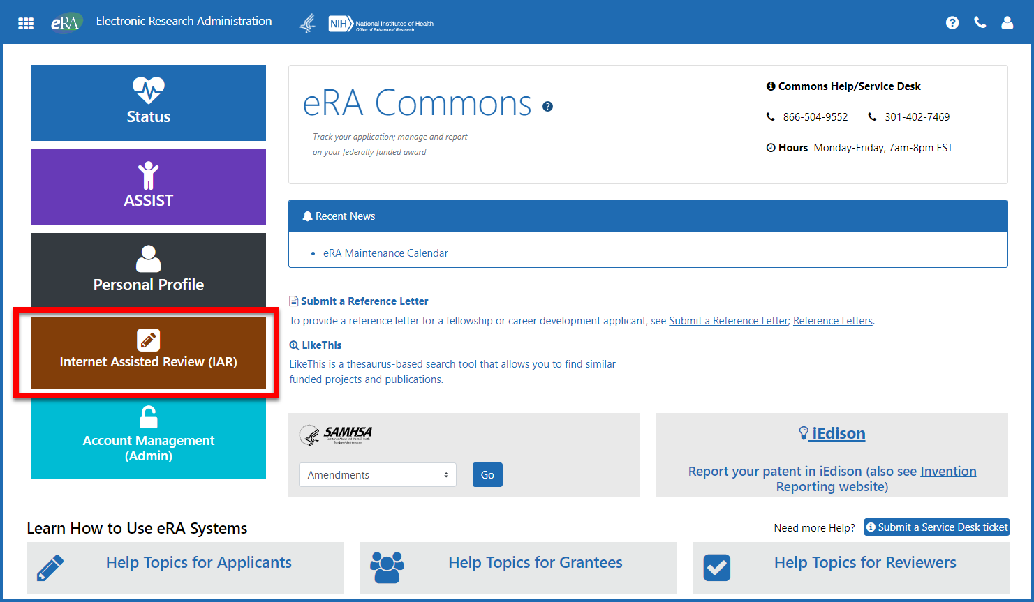
- A new navigation button will be added for the Internet Assisted Review (IAR) module. This button will provide quick and easy access to IAR and the numerous materials and resources reviewers need when participating in the peer review process. See Figure 1.

Figure 1: The eRA Commons landing screen highlighting the new IAR button
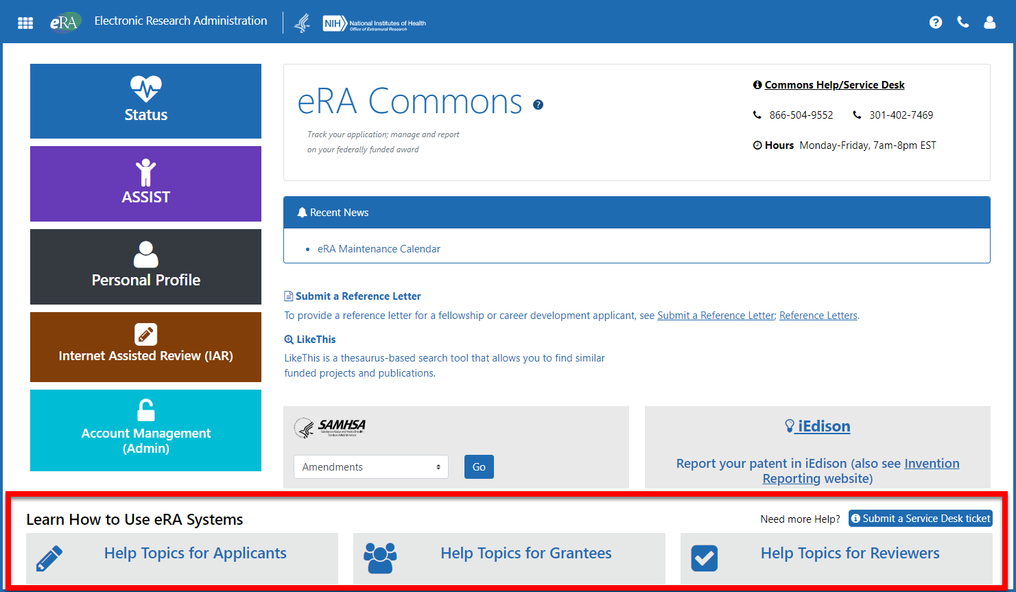
Buttons that access informational resources will be modified to differentiate themselves from the navigation buttons. The colors of the buttons will be toned-down and additional text will be added. Each button for Applicants, Grantees and Reviewers will be prefaced with the text “Help Topics for.” These changes are intended to alert the user that these items are resources and not access to specific eRA Commons functions. See Figure 2.

Figure 2: The eRA Commons landing screen highlighting the redesigned navigation buttons to access content specific informational web pages
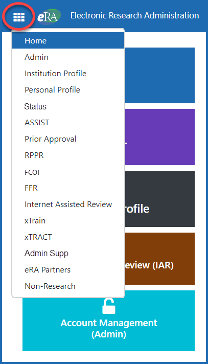
Navigation to other eRA modules within Commons remains via the apps icon ![]() in the upper left corner. Clicking the icon will present a dropdown menu of the eRA modules. See Figure 3.
in the upper left corner. Clicking the icon will present a dropdown menu of the eRA modules. See Figure 3.

Figure 3: The eRA Commons apps icon menu


 eRA Intranet