Say farewell to the legacy eRA Commons home screen. Introducing the new edition that is scheduled to be launched in early 2021.
Both the home screen (log-in screen) and the landing screen (screen when logged in) will sport a new look.
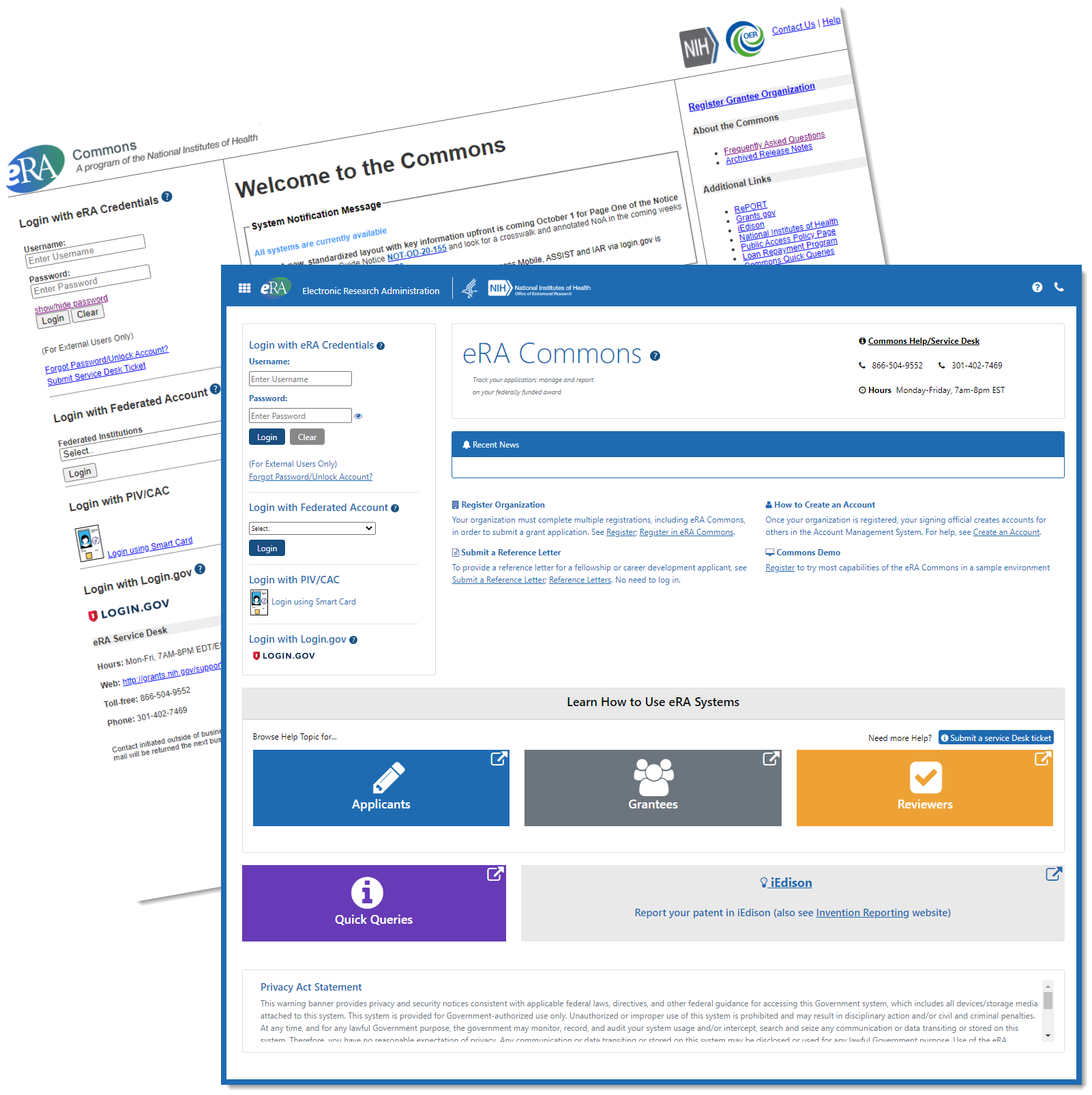
New home screen (log-in screen)

Figure 1: Screenshots of existing and future eRA Commons log-in screens
Key features
- Key information will be front and center – eRA Service Desk contact info, links to register an organization, to create an account, to submit a reference letter and to learn more about how to use eRA systems.
- Easy access to ‘quick queries’; the queries help users figure out if their organization is already registered in Commons, which grants are pending closeout and more.
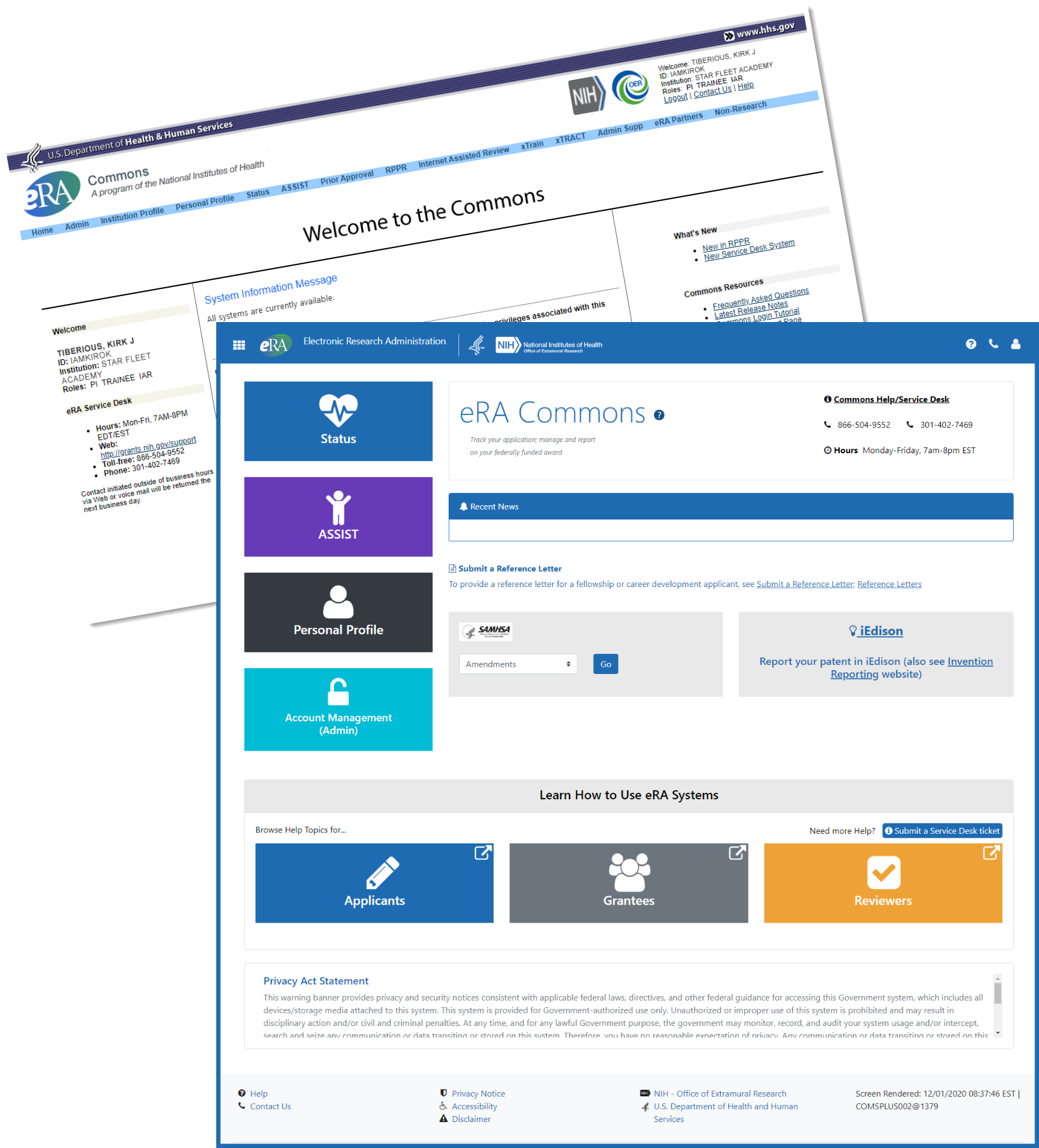
New landing screen (screen after log-in)

Figure 2: Screenshots of existing and future eRA Commons screens after log-in
Key features
- Gone are the days of cluttered navigation bars. After login, prominent buttons for status, personal profile and account management will get you where you want to go quickly.
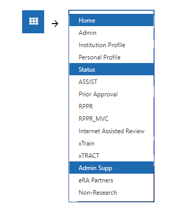
- Access other modules through a 9-square menu at the top left of the screen (see below)

Figure 3: 9-square menu to access other modules within eRA Commons
More information to come closer to launch.


 eRA Intranet