Navigating the Online Critique Screen
IMPORTANT: This topic is for Online Critiques only, which is a pilot of new functionality available to a limited subset of reviewers at this time.
Navigation in online critiques was designed with flexibility in mind so that you can devote screen space to the area that you are working on. Various user interface elements let you collapse and expand areas of the screen. Some UI elements, such as text formatting tools, appear only when and where you need them.
Each area of the screen and what you can do with it, is explained below. Use the Tab key to navigate to each editable text entry field.
Topics on page:
Identifying Critique You are Working On
Viewing the FOA and Grant Folder
Navigation Pane of Review Criteria
Blue and Green Critique Criteria Text Entry Areas
Opening an Online Critique
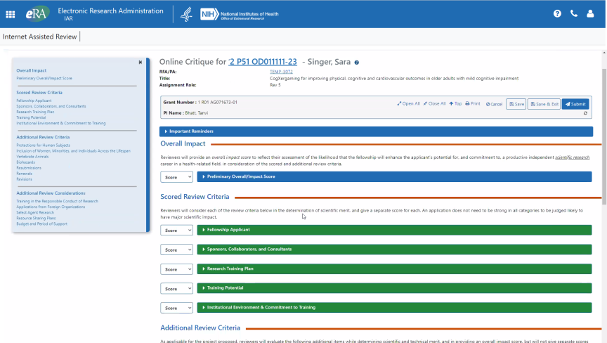
To open an online critique, log into Internet Assisted Review, open a meeting, and go to the List of All Applications screen or the List of My Assigned Applications screen. There, click the submit link in the Actions column for an application. Only those applications that are compatible with online critiques will open the Online Critique screen, which is shown below.

Floating Gray Summary Box
The gray floating summary box at the top of the Online Critique screen contains information to identify what application you are working on as well as buttons for navigation or actions you can take. This gray box floats on the page and remains at the top of the screen as you scroll down. It contains the grant number and principal investigator (PI) name to serve as a visual cue as to what application you are currently critiquing.
The gray box can appear in three different ways, depending on where you are in the online critique process:

ABOVE: Upon accessing the online critique for the first time, the floating gray box does not have a Delete button, but does have Save, Save & Exit, and Submit. The critique is editable.

ABOVE: If you save or submit an online critique, navigate away from the Online Critique screen, and return to the online critique later by clicking the submit link on the List of Applications screen, the online critique is initially read-only. You must click the Edit button to make it editable. Save and Submit buttons are unavailable while the critique is read-only.

ABOVE: The Delete button appears only the second time you access the Online Critique screen for a given application. If you go into a critique and save or submit it, then you return to the same online critique, and then you click Edit, you are presented with the gray box above, containing a Delete button. See Deleting an Online Critique.

ABOVE: The scientific review officer (SRO) or extramural support assistant (ESA) has the ability to open and edit a critique. If the SRO/ESA opens a critique and clicks the Edit button to make changes to it, it is locked to the reviewer until the SRO/ESA submits it. You can still view the critique, and you can see the changes the SRO/ESA has made, but you cannot continue editing until the SRO/ESA submits the critique.
Gray Box Action Buttons
The buttons on the floating gray box are as follows:
| Button | Action |
|---|---|

|
Expands all the data entry areas under the blue and green bars. |

|
Collapses all the data entry areas under bars. |

|
Jumps you to the top of the Online Critique screen. |

|
Opens the a print window with the critique, complete with review criteria, criteria descriptions, and data you have entered. Print to PDF for a file that you can store on your local hard drive. |

|
Discards any changes since the last manual save or the last autosave, and returns you to the List of Applications screen. Autosave occurs every minute and every time you click from one text entry field to another. A manual save occurs when you click the Save button. So in general, the Cancel button only discards the last 60 seconds of edits. To blank out a critique completely, use the Delete button instead. See Deleting an Online Critique. |

|
The autosave indicator tells you exactly when, down to the second, the last save occurred. You cannot turn the autosave function off. Autosave is currently configured to occur every minute and every time you click from one text entry field to another. |

|
Saves the draft online critique. |

|
Saves the draft online critique and returns to the List of Applications screen. |

|
Takes you to the Delete Critique/Score screen, where you can delete the draft and/or the submitted version. The Delete button does not appear on the Online Critique screen the first time you access an online critique. It appears only after you save or submit and then subsequently edit the unsubmitted draft or submitted version. In the Delete Critique/Score screen, you can see the save and submit dates and times of both your submitted version (if applicable) and your draft version. See Deleting an Online Critique. |

|
Starts the submittal of the online critique. See Completing an Online Critique. |

|
This button appears only if you have previously submitted or saved the online critique, and then you navigated away from the Online Critique screen and then you return to the critique. In that case, the online critique is initially read-only, and you must click the Edit button to make it editable. See Completing an Online Critique or Completing an Online Critique. |
Identifying Critique You are Working On
While you are working on critiques, you might open several critiques in separate tabs. There are a few visual aids to help you keep track of the critiques you are editing.
The browser tab label lists the principal investigator (PI) and grant number, as does the floating gray summary box that is always visible at the top of the screen.

In addition, the PI and grant number are always listed at the top of the screen:

Viewing the FOA and Grant Folder
Click the application number link to be taken to the application folder for this application. To view the complete FOA that this application is submitted under, click the RFA/PA link at the top of the Online Critique screen.

Navigation Pane of Review Criteria
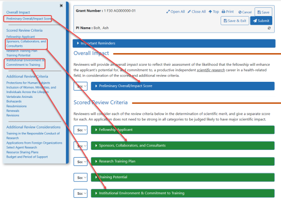
The navigation pane of review criteria on the left is essentially an interactive, clickable table of contents for the critique. These criteria are based on the activity code of the funding opportunity announcement (FOA) and are pulled directly from the Application Review Information section of the FOA. Each review criteria on the left links to the corresponding blue and green bars on the right.
To navigate quickly through areas of the critique, click on the list of review criteria on the left to be taken to the corresponding heading.

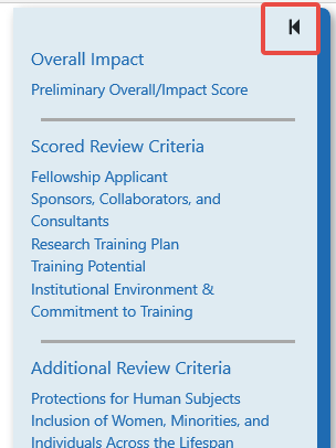
If you need more room onscreen to work, you can hide the navigation pane by clicking the back button highlighted in red.

If the navigation pane is hidden, click the forward button shown below to restore it. This button appears at the upper left of the Online Critiques screen anytime the navigation pane is hidden.

Blue and Green Critique Criteria Text Entry Areas
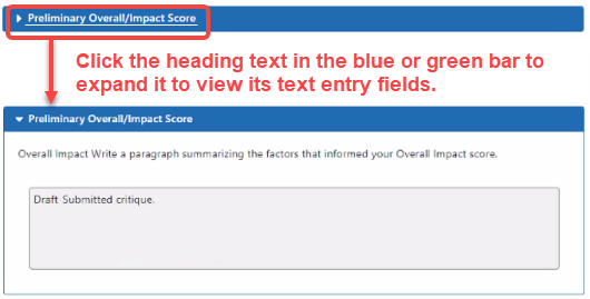
When you want to edit a review criteria of the critique, click its name on the blue or green bar to "open" it. The text entry fields or other fields such as radio buttons drop down under the blue or green bar.
The blue and green colors do not have any particular meaning, but are meant as visual cues to show the extent of the section you are in. The section colors alternate between blue and green.

See Editing in a Critique Text Field for filling out information under a blue or green heading.
