Navigating and Using the UI in eRA Modules
For increased usability, eRA modules are gradually switching to a streamlined, modern look and feel for screens. The new look and the new navigation adjust dynamically for a variety of screen or font sizes, making your browsing experience more efficient on the device of your choice. New UI elements offer a consistent set of tools that you can use across modules. A new header and footer conserve space, leaving more work area for you to accomplish your tasks.
This topic explores the new navigation and UI elements that you might see on updated screens. All modules will eventually use the same framework for building the UI and navigation through screens. Older style screens will co-exist with updated screens during the transition to the new look and feel.
Read this topic to learn about:
- Header/footer for eRA modules
- Navigation to and within modules
- Three-dot ellipsis button
- Standard tools for tables
- How columns are hidden and shown on small screens
Header and Footer Navigation
The header and footer use symbols to save screen real estate and dynamically adjust to fit smaller screens.

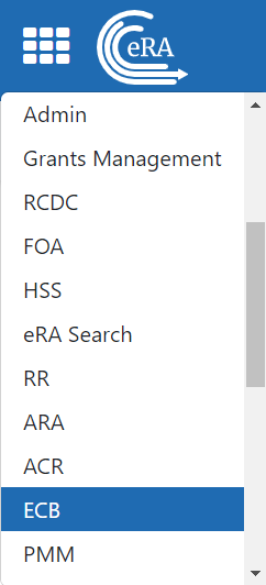
The first icon from left is the Apps menu. The Apps menu shows all apps available to the currently logged-in user, shown below:
Other Icons in Header
 Links to the Department of Health and Human Services.
 Links to grants.nih.gov.
 IC selector. Users with multiple ICs can select an IC here.
![]() Links to a general eRA Service Desk Support page.
Links to a general eRA Service Desk Support page.
![]() Links to eRA Points of Contact page.
Links to eRA Points of Contact page.
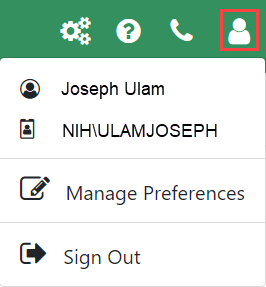
![]() The person icon shows your login information, preferences, and sign out link:
The person icon shows your login information, preferences, and sign out link:
Dynamic Header
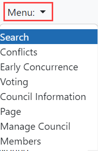
Below, on a narrow screen, most items on the header are hidden, but they pop down when you click the icon in the upper right, indicated below. The ECB toolbar is available by clicking the Menu drop-down on the left side of the screen.

Redesigned Footer
The footer is clean and offers only essential information organized into columns.

Navigating Within a Module
The module abbreviation, circled below left, lets you quickly see which module you are working in. The shaded tab name indicates the active screen.

The sections of the modules are listed across the top, with the current section highlighted in gray, circled above.
To navigate to another screen, click the screen name on the menu bar.
If the screen size is small, all the screen names are collapsed under a Menu drop-down in the upper-left corner of the screen, shown below.
Three-dot ellipsis button
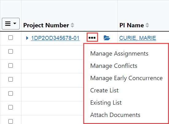
Actions that are available for each row in a table are displayed under the  three-dot ellipsis button, as shown below.
Standard Tools for Tables
Tables are sleeker with tools for showing the data you want to see. See below for explanations of table tools.

Filter
Entering filter text features instant filtering of the list as you type, with the number of found results updated as you type. The text you type in the filter is highlighted in the table.

Filterable fields vary on each page, but typically include Project Number, PI Name, and other text-based fields.
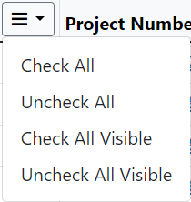
Selecting Rows/Bulk Action Tool
Use the bulk actions tool  to select or deselect all rows on all pages, or to select or deselect all rows that are currently visible, such as those found by typing filter text or all rows on the current page.
Column Picker
Click to choose the visible columns in a table by selecting/deselecting their checkboxes using the column picker tool. The column selection is only in effect until the screen is refreshed.

Column Sorting
Click a column header to sort by that column.

Download and Print
Use the download tool, shown below, to export table data to Excel.

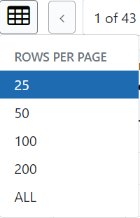
Rows Per Page
To help avoid scrolling, use the Rows Per Page tool to specify how many table rows appear per page.
Page Navigation
Navigate to each page of search results using the following tool:

You may also click the X of Y field to display a drop-down that allows you to jump to a certain page.
Toggle Switches
Toggles can be in one of two states: toggled on or toggled off:

