Using ASSIST
To navigate through the application in ASSIST, select any of the buttons in the Actions section, the links in the Component Type section of the left-side navigation area (for multi-project applications only), or other links located on the ASSIST pages.
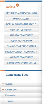
Actions
The Actions section of the left-side navigation provides buttons for accessing the features available for the application (or multi-project component) currently displayed on the page. Some of these buttons remain on the screen at all times. Other buttons are removed or added to this area depending on what is being viewed at the time. For example, for multi-project applications, the available buttons featured in Actions when the Application Information page is displayed differ from those featured when the Core Information page is displayed, because the actions taken against an entire application differ from those taken against an individual component (e.g., Update Submission Status vs. Update Component Status). The available Actions buttons also may change depending on the status of an application or component.
Component Type
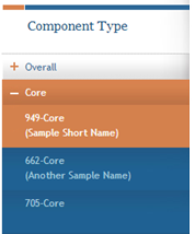
The Component Type section of the left-side navigation appears only for multi-project applications and lists the different component types included in the application. Components of the same type are grouped together and displayed under that specific component type heading (e.g., if three different Project components were initiated, all three are listed under the Project heading). To view all the components of a certain component type, click the component type heading, which is displayed next to a plus sign (+). To hide the components, select the component type heading when the minus sign (-) is displayed.
The components are listed with numeric identifiers, not the actual component title names; however optional component short names (when added to a component) display beneath the numeric identifier and can aid in keeping track of the different components.
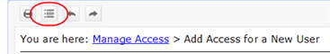
Breadcrumbs
The breadcrumb links at the top of the ASSIST page may be used to navigate back and forth through pages already visited. The breadcrumbs display a trail indicating how the current page was accessed. To view any of the prior pages, select the page name link within the breadcrumbs.

Component Form Tabs
A component is a named, agency-defined collection of data elements that may be repeated within an application. When the Component Information is accessed for an Overall or individual component, the included forms for that component are listed across the page in tabs. Each tab displays the name of the particular form it represents. To navigate among the forms, select the form tab.
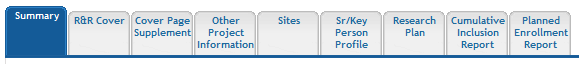
NOTE: The image above is a sample of component form tabs and does not reflect the forms available for every application.
Navigational Links
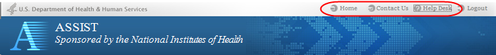
Across the top of every ASSIST page, next to the Logout link, are the links for accessing the ASSIST Home page (Home), for contacting system support (Contact Us), and for accessing eRA Service Desk support information (Help Desk). Select the appropriate link to access this information.
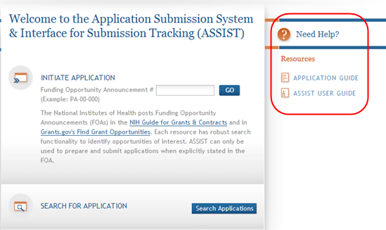
Online Help
Various sources of help exist for the ASSIST. The Welcome page Resources section contains links for the Application Guide and the ASSIST User Guide. In addition, the Need Help? icon launches the ASSIST online help feature in a separate browser window.
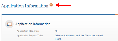
The online help feature is also available for specific topics by selecting the ? icon from the various pages in ASSIST. Selecting the icon from a specific page (rather than from the Welcome page) opens the online help for that specific topic.
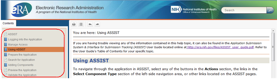
No matter how online help is accessed, all topics covered in the online help are accessible via the Contents list on the left side of the online help window.
Many help topics include figures or additional steps for those who need it. This information is hidden by default with togglers. Click the arrow icons or orange text when available to expand specific hidden text or figures; click again to hide it.
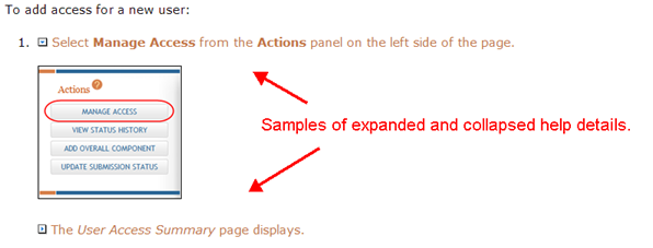
The Expand All/Collapse All button located above the breadcrumbs at the top of each help screen expands (or collapses) all hidden text and images within the current topic.
NOTE: Some screens may not display correctly in the Internet Explorer browser with Compatibility Mode turned on. To ensure that the screens are correctly displayed, turn off Compatibility Mode or use a different browser.
